




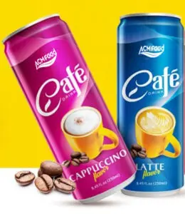



Beverage can packaging comes in three body shapes that dominate the private label market: standard, slim and sleek. All three hold the same liquid and run on largely the same filling infrastructure, but they differ enough in diameter and height to change how a can looks on shelf, how it costs to decorate, and which retail channel it tends to suit.
This guide compares the three shapes directly, explains what a brand is actually paying for when it chooses one over another, and sets out how the decision interacts with minimum order quantity and artwork.
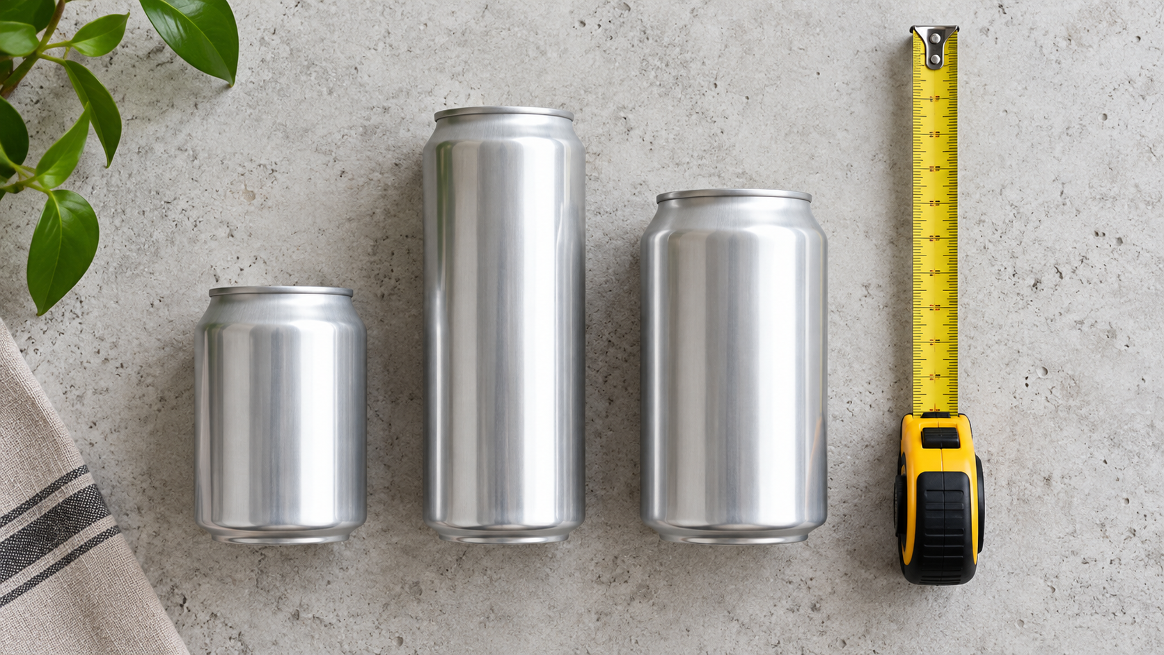
Standard, slim and sleek: what the names actually mean
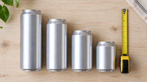
The three shapes are distinguished by diameter relative to height, not by volume. A standard can is the classic proportion most consumers picture by default: a wider diameter and a shorter body for a given volume. A slim can narrows the diameter and lengthens the body somewhat. A sleek can narrows further still, producing the tallest, most slender profile of the three at the same fill volume.
| Format | Proportions | Typical positioning | Decoration cost tendency |
|---|---|---|---|
| Standard can | Wider diameter, shorter body | Mainstream, high-volume retail | Lowest, due to scale and widespread tooling |
| Slim can | Moderately narrower and taller | Mid-tier and lifestyle-positioned drinks | Moderate |
| Sleek can | Narrowest, tallest profile | Premium and functional positioning | Typically highest, reflecting lower production scale |
Why proportion changes how a can reads on shelf
A taller, narrower can occupies less shelf width for the same volume, which lets a retailer fit more facings into the same linear space, and it reads visually as more refined even before any graphic design is applied. This is the main reason sleek and slim formats are associated with premium positioning: the shape itself signals a different category before the consumer reads the label.
A standard can, by contrast, reads as familiar and unremarkable, which is exactly the point in a mainstream, high-volume listing where the goal is recognition and shelf efficiency rather than differentiation. Neither shape is objectively better; they answer different commercial questions.
Standard cans: the volume workhorse
Standard cans are produced at the largest scale globally, which keeps both the empty can cost and the decoration cost lower than the other two formats at equivalent order sizes. Filling lines, cartoning equipment and retail fixtures are built around this shape as the default, so a first order in a standard can generally moves through production with the fewest format-related questions.
For a brand prioritising cost efficiency and broad retail compatibility over shelf differentiation, standard is usually the pragmatic starting point, particularly for a first export order where minimising variables matters more than maximising shelf impact. It is also the format most retail buyers evaluate fastest, precisely because it introduces nothing unfamiliar into a category review that already has to cover flavour, claims and price.
Slim cans: the middle ground
Slim cans sit between standard and sleek in both proportion and cost, offering a visibly different silhouette without the premium cost load of the narrowest format. They are a common choice for a brand wanting to signal a step up from a mainstream product without committing to the cost structure of a fully premium presentation.
Ranges built around a distinct flavour story, such as a citrus and coconut combination like orange juice with coconut cream, often use a slim format to support that positioning without pricing the product out of a mid-tier retail set.

Sleek cans: the premium and functional default
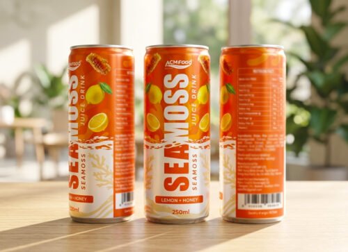
Sleek cans carry the strongest premium association of the three, and they are also the format most commonly used for functional and better-for-you positioning, where the narrower profile reinforces a lighter, more considered product image. The trade-off is decoration cost and, in many supply chains, a higher minimum order quantity, since sleek cans are produced at lower volumes than standard cans and the print runs that decorate them follow the same pattern.
Carbonated and sparkling products aimed at a premium consumer, including formats similar to a lime sparkling drink, frequently default to sleek for this reason: the shape does part of the premium positioning work before the flavour or the claim is even read.
How shape interacts with decoration method
All three shapes can be decorated with either a full-body shrink sleeve or a directly printed can, but the economics differ by format. A directly printed standard can benefits from the largest production scale and is usually the least expensive route at volume. A shrink sleeve is more format-flexible, since the same sleeve tooling can sometimes be adapted across similar can heights, which can help a brand testing more than one shape without committing to separate can-printing tooling for each.
Where a brand is undecided between shapes, starting with sleeve decoration on a smaller trial order can be a way to test market response to a shape before committing to a larger printed-can run.
How the choice affects minimum order quantity
Shape affects minimum order quantity mainly through can supply and decoration tooling rather than through the liquid fill. A standard can, produced continuously in high volume by container suppliers, generally carries the most accessible minimum order. Slim and sleek cans, produced at lower overall volumes, more often run in scheduled batches, which can raise the quantity a first order needs to commit to.
This is not a fixed rule across every supplier relationship, but it is a pattern worth checking early. A brand set on a sleek can for premium positioning should confirm the minimum order and lead time for that specific format before finalising a launch plan, rather than assuming it will match a standard-can quote. Three checks catch most surprises before they become launch delays:
- Ask for the minimum by shape, not by volume. A supplier’s headline minimum order often describes their most common format; a less common shape at the same volume may carry a different number.
- Confirm whether the decoration method changes the minimum. A shrink sleeve and a directly printed can on the same body shape can carry different print minimums.
- Check the minimum per flavour if launching a range. Each variant typically needs its own printed components at the chosen shape, so a range minimum is rarely just the single-SKU figure multiplied by the number of flavours.
Matching can shape to the product concept
Four questions generally point a brand toward the right shape faster than comparing costs in isolation.
- What shelf tier is the product entering? Mainstream volume retail favours standard; mid-tier and lifestyle positioning favours slim; premium and functional positioning favours sleek.
- How sensitive is the launch to minimum order size? A brand needing the smallest accessible first order should lean toward standard unless the premium positioning is commercially essential.
- Does the flavour or formulation story need visual support? A distinctive shape reinforces a distinctive product; a familiar shape suits a familiar product.
- Is the format going to run across a whole range or one hero product? Committing a full multi-flavour range to a premium shape multiplies the decoration cost across every variant, which is worth costing out before the format is locked.
Products built specifically around a functional or inclusion-based point of difference, such as a formulation with nata de coco inclusions, sometimes need the can shape to accommodate specific fill and headspace requirements as well as the visual positioning, which is worth raising with a manufacturer alongside the shape decision itself.
What a shape switch actually touches
Changing can shape after a range is already running is more common than brands expect, usually driven by a retail buyer’s feedback or by a move into a new channel with different shelf expectations. The change reaches further than the can itself: artwork has to be redrawn to the new proportions, any tooling specific to the old shape’s decoration is no longer usable, and the factory needs lead time to source the new can in the required quantity.
None of this affects the formulation, which is the one part of the product that stays constant through a shape change. Brands planning a shape switch are better served treating it as a packaging project with its own timeline than folding it into an unrelated production order, since the two have different dependencies and different risks of delay.

Frequently asked questions
Do all three shapes hold the same range of volumes?
Broadly yes, though the most common volume-and-shape pairings differ by market convention. A given volume is achievable in any of the three shapes by adjusting height and diameter, but not every combination is equally available off the shelf from every can supplier, so it is worth confirming availability for a specific volume and shape pairing before finalising a spec.
Can a brand switch shape after launch without reformulating?
Yes, in almost all cases. The liquid formulation is independent of the can shape, so a switch from standard to sleek, for example, is a packaging and artwork change rather than a product change. What does need rework is the label artwork, since the printable area and proportions differ between shapes.
Is sleek always more expensive than standard?
At comparable order volumes, yes, because of lower production scale for the empty can and the decoration tooling. At very high volumes the gap narrows, since fixed tooling costs are spread across more units, but sleek rarely matches standard’s cost efficiency at typical first-order quantities.
Which shape is easiest for a first-time exporter to start with?
Standard, in most cases, because it offers the most accessible minimum order quantity and the widest compatibility with retail fixtures and existing production schedules. A brand can move to a more distinctive shape once volume has grown and the format decision carries less first-order risk.
Does can shape affect shelf life?
Not materially. Shelf life is governed by the barrier properties of the aluminium and the seal, both of which are consistent across standard, slim and sleek formats at the same wall thickness. Shape influences how a product is perceived and where it sits on the shelf, not how long it keeps.
Choosing the shape that matches the commercial goal
Can shape is a positioning tool as much as a packaging spec. Standard suits volume and cost efficiency, slim offers a visible step up without full premium cost, and sleek carries the strongest premium and functional signal at the highest decoration cost and typically the tightest minimum order.
ACM Beverage produces across standard, slim and sleek formats and can advise on minimum order and lead time for a specific shape before a launch plan is finalised. A product brief naming the target retail tier and the expected first-order volume is usually enough to narrow the shape decision to one clear option, rather than starting from three and comparing every combination of shape and decoration method from scratch. Reach out through the enquiry and contact page to start that conversation, or review what else can be customised on an existing formula before settling on a final specification.